Fun-for-Seniors
A web & mobile-based platform designed to connect the senior citizens of NYC to all the recreational activities available
Role
Product Designer
Tasks
UX Design & Research; Usability Testing; Ethnography;
Storyboarding; User Persona; Rapid Prototyping
Format
Web- & Mobile-based platform
Tools
Sketch; Axure;
Adobe Illustrator; Adobe Photoshop
Problem
Challenges faced by elderly people in NYC due to lack of a centralized system to access the existing resources as they are pretty much scattered and unknown to people.
Discovery Phase
To get some insights into the initiatives & policies for senior citizens in NYC, I started market research by collecting some key points that are enlisted in the NYC Ageing Annual Plan. In order to design a user-friendly solution, I followed a Participatory Design approach which is a research technique to actively involve all stakeholders in the design process so that their needs are met appropriately.
To jumpstart the process and get insights about my users and the challenges they face, I used two UX research methods:
- Contextual Inquiry, which is a one-on-one interview with the user to get detailed data about product or design situated in the context of its use and need. It helps the designer to get first-hand data about the usability factors that govern the design of the product.
- Rapid Ethnography , which is a collection of field methods to provide designers with a reasonable understanding of users and their activities given a limited amount of time spent in the field gathering data.


Design Challenge
How might we design a product or service for the elderly people that is appealing, easily accessible and simple to understand so that it can be integrated with their daily life activities?
Solution
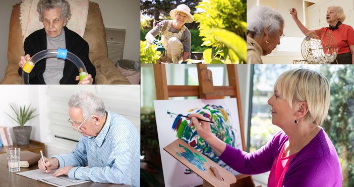
Our solution should aim to reduce the struggles that are faced by them in the day-to-day life for which the design has to be as user-friendly as possible. Fun for Seniors is a centralized, user-friendly platform created for seniors living in NYC so that they can access the recreational resources collectively at one place which makes it more like a one-stop-shop for them.
Design Process
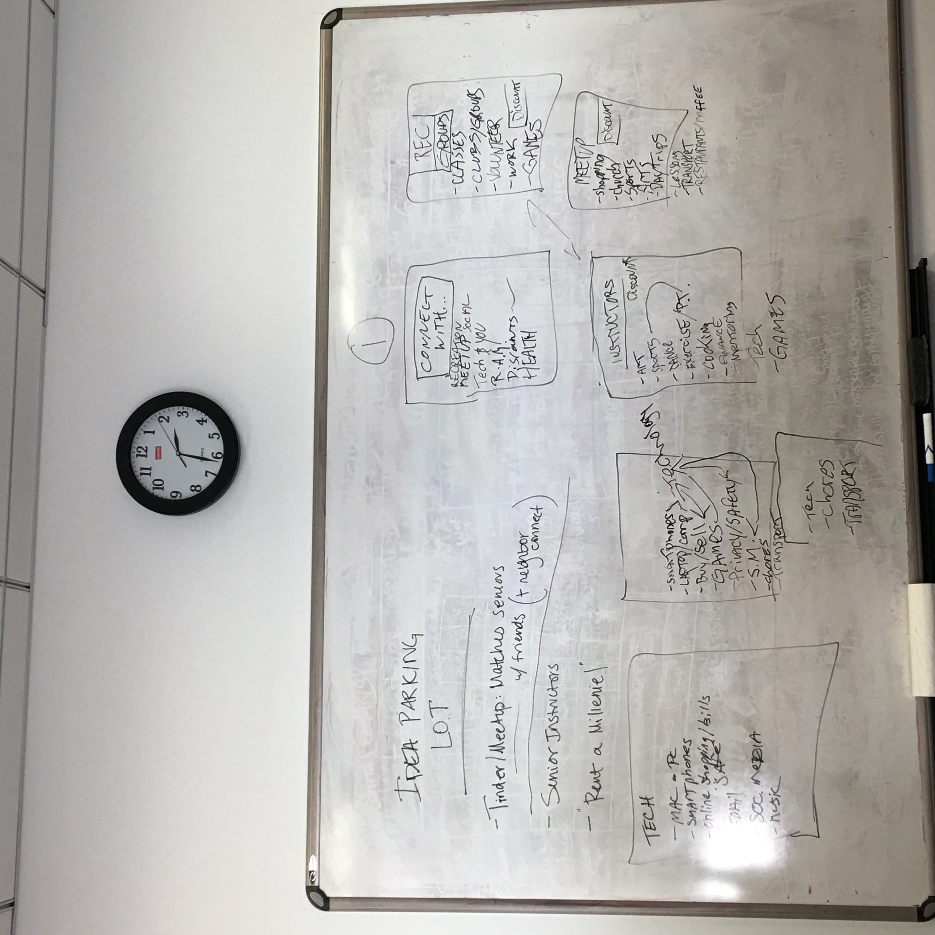
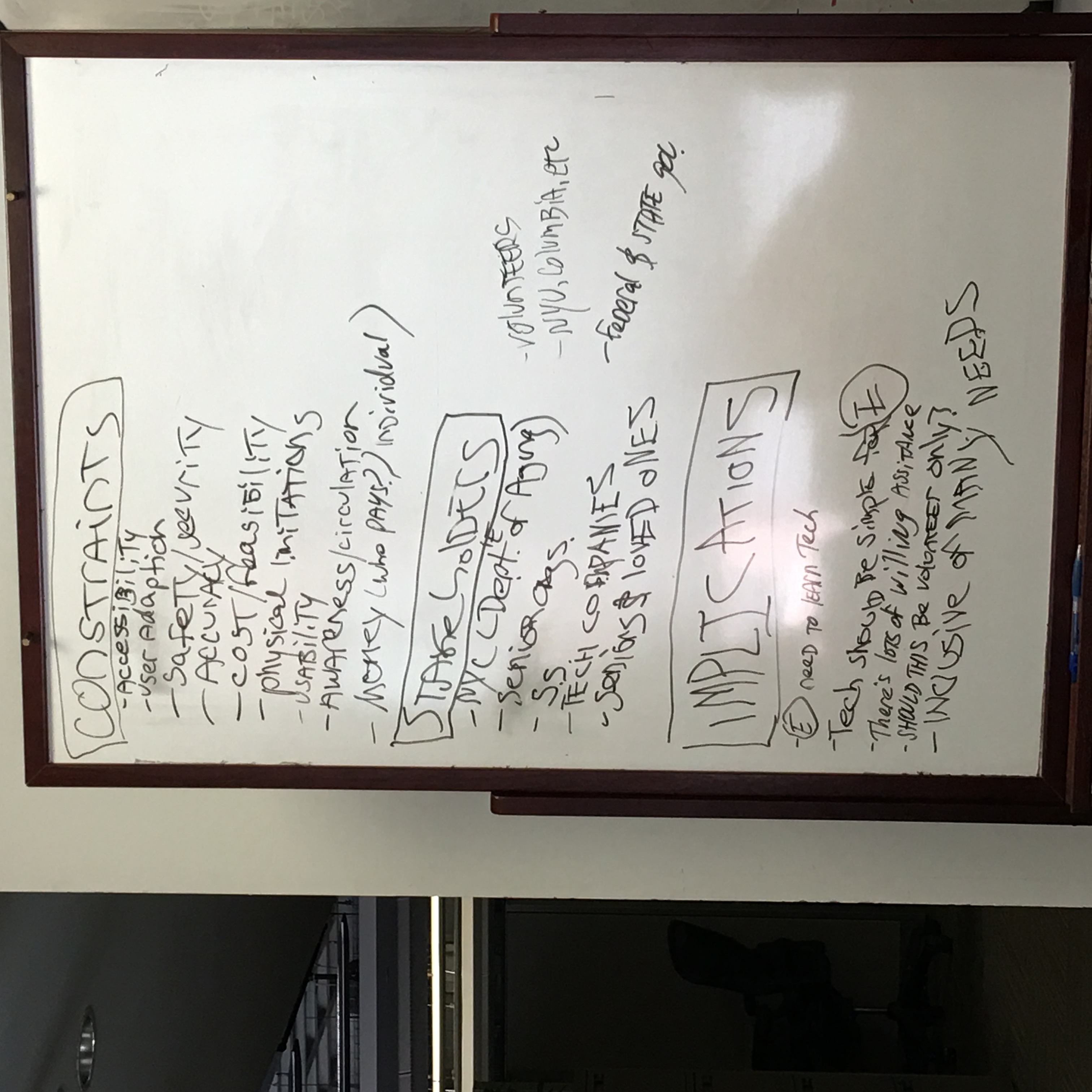
I collaborated with my classmates and started brainstorming ideas based on the challenges presented by target users. Further, I used Affinity Diagrams to segregate all the ideas into different categories by classifying them into various themes.
Design Concepts
I used agile methodology to design a user-friendly solution that required me to do rapid prototyping of the 3 most commonly voted concepts. Here are the three design concepts along with their rationale & implementation:
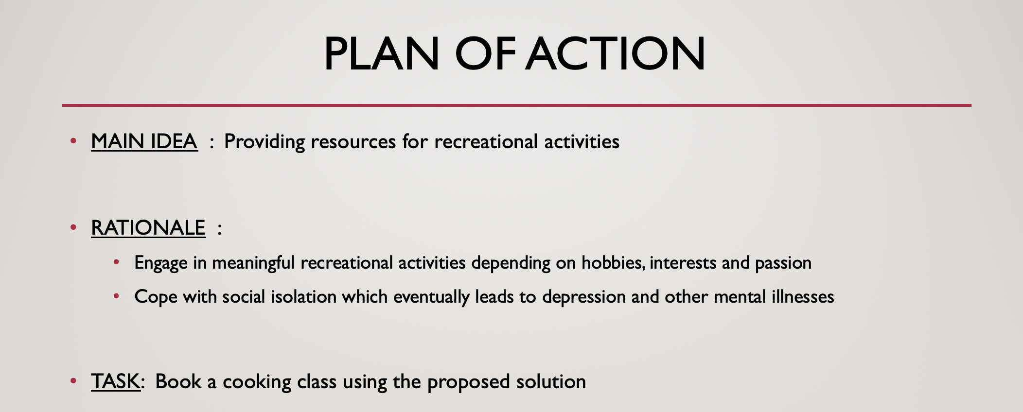
Design 1 : Providing Resources for Recreational Activities
- Provide resources that exist in the city to engage in meaningful recreational activities based on interests, hobbies, passions, etc.
- This typically aims to help the elderly deal with the issue of social isolation that results in numerous mental illnesses.
- This can also be used as a way to take classes in different activity areas and at the same time use the same platform to host classes on their own. For example, if they want to host a class on culinary skills or baking, they can use this platform to do the same.


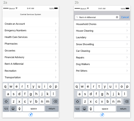
Design 2 : Providing Resources for Rent-A-Millennial
- This concept caters to providing assistance to elderly people by hiring people for different activities such as cleaning, doing household chores, snow shoveling, etc.
- They can simply click on the type of work they want and then select people from different profiles on different wages that they would have for doing a particular task.

Design 3 : Providing Resources for Health Care Services
- This creates a centralized platform where they can access information about various kinds of health-care providers.
- They can pick and choose based on their problem, cost, location, rating, etc.
- It comprises several kinds of health care needs not just restricted to hard-core medical treatments.

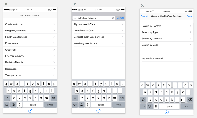
Mock-up of Project Prototype
The following storyboards show the user exerperience walkthrough that has been translated into a digital prototype which can be viewed here.

Usability Testing

First Iteration
Criteria to Judge the Success of Proposed Design:
- How many users know about the product?
- How many users use the product in their daily lives?
- How many users are happy and satisfied with the service?
- How many users find it difficult to navigate the product?
- Do people want to learn more about the functionalities of the product?
- Do people feel that this product is helpful for them?
- Is it readily available to them?
- Is it easily accessible to them?
- How likely are they to continue to use it in the future?
- How likely are they to recommend it to their friends?
- Are they keen to have similar kinds of stuff in the future?
- Does it cater to the actual challenges faced by the elderly?v
- Are the design and other aesthetics providing a smooth user experience to the audience?
Personal Reflections:
Once I finished designing my first prototype of the interface, I knew that I needed to get it out for the users to see if the experience is smooth and easy for them. But I didn’t know that my first user testing would happen without any preparation! While travelling in the subway, I was working on the design of the prototype when the elderly lady sitting next to me got curious about it. She wanted to know why am I designing a website for senior citizens and where do I work etc. She asked me “Can I use this?” I told her that it’s not in the final form but I would definitely want to see if she likes using the website or no. I gave here a quick description of the task and scenario where this would be used by people and showed her the prototype. She used the interface and gave me the much-needed feedback. For instance, she said that as an elderly person, it’s hard for me to read this font size. She also felt that the items on the screen were too many and too tiny for her to focus on exactly what she wants to do. Although I could just have a small follow-up conversation with her, that made me think about the readings and class discussion on ‘making assumptions while designing’. I realized the kind of hidden assumptions I had while putting together the first prototype. It seemed comfortable to me probably because I was the one who was setting it up but for actual users, it was such a difficult experience to navigate the space. That made me change my focus to design for the user, not myself!
Second Iteration
Testing Protocol
- Prepare a storyboard for the idea on designing an interface/application on providing centralized access to recreational facilities to the elderly population.
- Give them a brief introduction about my idea and the intent behind creating such a platform for them.
- Explain to them a reason for conducting this observation study.
- Demonstrate with an example of how to do “think-aloud” while going through a particular task.
- Give them a copy of my storyboards and ask them to interpret it by themselves from the drawings. At this stage, I would ask them to “think-aloud” as they proceed along the storyline by themselves. This will help me know the parts of my sketches that have missing information or that are creating confusion for the users.
- Now explain them the storyboards myself and seek feedback from them. I will be doing a compare-contrast between the data obtained at this step and the previous step. This will help me to understand the loop-holes in the design ideation and also get insights about user expectations from such a product.
- Discuss with them if they have any more suggestions for the same.
- Thank them for their valuable time and feedback.
Questions to be Addressed
- Is the product in sync with the user’s expectations?
- Does the product have a potential to be successful in the current market scenario?
- Is the product user-friendly??
- Does it cater to the needs of the users for which it is intended??
- Does it have a far-reaching impact on the social-intellectual functioning of the elderly?
Personal Reflections
I think “think-aloud” will be the best approach because the data will give me insights about the kinds of challenges that the elderly face while using the platform. There are many advantages, one of them being that it serves as a “window on the soul” which lets you discover what users really think about your design. Specifically, in my context where the user is somebody who may or may not be comfortable in using such a platform, it is all the more important for me to know if it is “really” easy-to-access for them. This sort of a user testing session will also reveal some of the assumptions that I would have made while designing the platform since I am pretty comfortable using such platforms on a day-to-day basis. It will give me specific feedback points where the design will have glitches and thereby help me improvise it for the better so as to provide a smooth user experience to my target audience.

For a detailed description of the project & references, please access the design document here.
Supervised by: Ralph Vacca